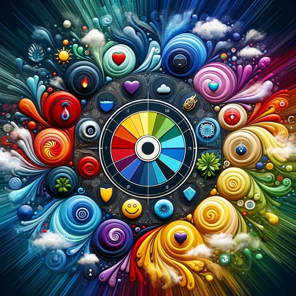
Choosing the Right Colors for Your Brand

Choosing the Right Colors for Your Brand: A Guide to Color Psychology in Printing
Introduction: When it comes to branding, colors do much more than just make things look attractive; they convey emotions, feelings, and experiences. The colors you choose for your brand are pivotal in determining how your audience perceives and interacts with your business. This guide explores how to select the right colors for your brand, leveraging the psychology of colors to enhance your brand identity and communication.
Understanding Color Psychology: Color psychology is the study of how colors influence human behavior and emotions. Different colors can evoke different feelings and reactions. For instance, red can trigger feelings of excitement and urgency, while blue can instill a sense of trust and calmness. Understanding these emotional associations is key to selecting colors that align with your brand's values and messaging.
The Significance of Brand Colors: Your brand colors are a visual representation of your company’s identity. They play a crucial role in how customers perceive your brand. Consistent use of these colors across all your marketing materials, from your logo to your packaging, helps in building brand recognition and loyalty.
Choosing Your Brand Colors:
Reflect on Your Brand Personality: Start by considering what your brand stands for. Is it youthful and energetic or sophisticated and luxurious? Your colors should align with these attributes.
-
Consider Your Target Audience: Different demographic groups may respond differently to certain colors. For example, younger audiences might be drawn to brighter, more vibrant colors, while an older, more conservative demographic might prefer muted tones.
-
Analyze Competitors: Look at the color choices of your competitors. While you want to ensure your colors are distinct, understanding industry norms can be beneficial.
-
Limit Your Palette: Too many colors can be overwhelming and dilute your branding efforts. Most brands stick to two or three primary colors, with additional shades for accents.
The Psychology of Common Brand Colors:
- Red: Symbolizes energy, passion, and action. Ideal for brands that want to convey excitement or prompt a quick decision.
- Blue: Represents trust, security, and stability. Often used by financial institutions and tech companies.
- Green: Associated with health, growth, and tranquility. Perfect for environmental, wellness, or outdoor brands.
- Yellow: Evokes optimism, clarity, and warmth. Great for brands that want to appear accessible and friendly.
- Purple: Conveys luxury, creativity, and mystery. Suitable for beauty and luxury brands.
- Black: Represents sophistication, power, and elegance. Often used by high-end and luxury brands.
Testing and Implementation: Once you’ve selected your colors, test them across various mediums. Check how they look in digital formats as well as in print, as colors can vary between screens and printed materials. Ensure your chosen colors are versatile and scalable across all marketing channels.


